I'm sure most of you are familiar with Amazon.com's home page. Opinions about the layout of this page are varied, some feel it is too cluttered, others love how detailed and personalized it is. From an HCI perspective, there are several elements in Amazon's home page that make it interesting. Amazon has fine tuned every aspect of this page, including its hover menus. A hover menu is a menu on a web page that expands itself when you hover your mouse over an item (so there is no need to actually click on the menu item). The video below illustrates a typical hover menu.
The idea behind using Hover Menus is to save time. However, most web pages that make heavy use of these menus end up making life difficult for their users, specially when it comes to navigating down to a sub-menu. This requires extra care, forcing users to move the mouse pointer very carefully (called following a "hover tunnel") to the required sub-menu to avoid expanding any intermediary items.
To understand what a hover tunnel and why this is so tricky to avoid, read this excellent article published at UXMovement : Why Hover menus do more harm than good.
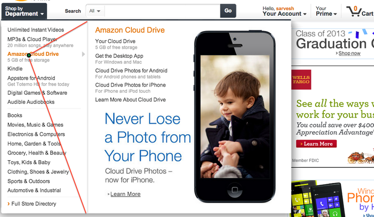
Amazon.com's homepage uses these menus extensively yet remains easy to navigate. The engineers at Amazon do this by predicting the direction that your mouse pointer is most likely to take when you start hovering. Based on where your cursor is, one can draw a triangle that connects the cursor to the two ends of the menu (shown below). Imagine your cursor is at the green point (right above "Amazon Cloud Drive"). Now as long as your mouse cursor is inside the red triangle, the "Amazon Cloud Drive" menu will remain open even if your mouse hovers above "Appstore for Android" or "Digital Games & Software".
To understand what a hover tunnel and why this is so tricky to avoid, read this excellent article published at UXMovement : Why Hover menus do more harm than good.
Amazon.com's homepage uses these menus extensively yet remains easy to navigate. The engineers at Amazon do this by predicting the direction that your mouse pointer is most likely to take when you start hovering. Based on where your cursor is, one can draw a triangle that connects the cursor to the two ends of the menu (shown below). Imagine your cursor is at the green point (right above "Amazon Cloud Drive"). Now as long as your mouse cursor is inside the red triangle, the "Amazon Cloud Drive" menu will remain open even if your mouse hovers above "Appstore for Android" or "Digital Games & Software".
The YouTube video below shows a live demonstration of this. Hence based on the path of the mouse cursor, Amazon.com's page does not expand any intermediary menu items while you navigate to your end goal. It is this level of refinement and care towards user experience, that makes Amazon.com the success that it is today.
 RSS Feed
